Tone - Work Diary
Tone was an interesting shoot and the editing involved using both greyscale and duotone. Editing and shooting tone makes it very easy to grasp, and the look of the pictures with a lack of colour while using mainly their tone could be useful in the future.
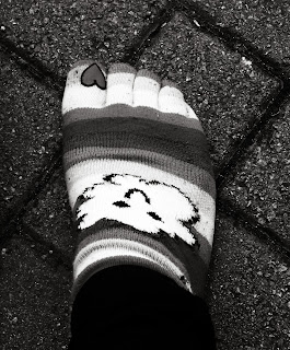 This is a picture of my my sock with my foot in it. I have changed the picture to greyscale to remove the colour and did not duotone it. I think this is a god example of tone because my sock is usually multicoloured but here many of the tones can be seen as quite similar as the colour has been removed.
This was not a picture that was chosen for my straight prints, I think the photo is not very interesting, it's very much generic and does not look professional, nor does it represent tone very well. I wanted to take pictures of the engine and some old cars to create an antique look, this was not achieved.
If I were to continue with this session I would look for more pictures that would usually look vibrant and colourful as well as pursuing my 'antique-looking' photograph with a duotone.
Shape - Work Diary
I enjoyed this lesson very much, I used many shadows and silhouettes, though they won't be shown so well in the examples as I cannot upload my edited pictures to the blog. I enjoyed the shadows and the silhouettes and would gladly use this concept in future projects if possible.
This photograph simply shows a shadow of myself, it is not a great photo and I'm sure something better could have been devised with a little more thought and time, though I like the concept of shadow pictures.
 This photograph looks a lot better when edited, everything but the leaf on the post is black, while the leaf keeps it's bright, autumn colours. It is clearly defined and I lie the style of this photograph.
If I were to do this session again I would take more time in the taking of photographs and would perhaps take some time designing something to shoot the shadow/silhouette of.
Depth - Work Diary
I though that I was enjoying this session and that I had found many photos that showed depth. However, only a few of my photographs actually represent depth properly as I was told by my tutor after the session.
This photograph does properly represent depth, the converging parallels on the bricks and the way that the wall become narrower show this.
This is one of the many photographs that I thought represents depth but doesn't, I though that simply showing that something further than another could represent depth instead of using converging parallels and narrowing objects over a distance.
If I were to continue this session I would take many more photos like the one at the top, though hopefully of better quality as these photos actually represent depth unlike the majority that I have taken.
Pattern - Work Diary
Shooting pattern was very similar to shooting lines, lots of lines are made into patterns in the man-made structures that I was looking at. I did not enjoy this shooting session as much as I enjoyed shooting colour. LIke lines this subject is more tedious than colour, especially around the college as there is not a great variety of entirely different or interesting patterns.
This photo is very similar to those of that I took of walls and lines in the previous formal element. THey vary in the way that lines, obviously concentrate on the lines in the walls, usually following a similar direction. Pattern concentrates on the repeated shape in the walls and in this case on the floor.
 I was trying hard to find pattern in nature and flowers, as you can see this didn't go very well, though I'm sure I could find pattern in some plant or another.
If I were to continue this session I would pursue patterns in nature and the outdoors.
Colour - Work Diary
I enjoyed this session, Colour is easy to shoot and many different, interesting things can be looked at. This was my first chance to really take pictures of the colourful things outside and in nature.
 I like this photograph and I think that it represents colour very well. It is a very bright colour, and I think that somebody looking at this picture could guess what it represents.
I like this photo, also. I think that it certainly represents colour, it is simple and the colour stands out from the dull table. I used this for my straight prints.
If I were to continue to do this element I would do so in brighter weather so that more pictures of the outside could be taken.
Work Diary - Blurring
In this session we changed the shutter speed of our cameras to a much slower shutter speed. Doing this made the photos blurry and made shooting outside impossible. It was difficult to know how to get good blurred shots and I wasn't too sure as to whether or not there was a particular type of blurring that I was looking for.
 I was trying to create photos using blurring that represented speed or movement, this photo doesn't show that. It was hard to keep any one thing in focus. Had photos like this one worked I think they could have looked quite good.
 This photograph was chosen by my tutor for one of my straight prints. I didn't think that it was a good photo and certainly didn't think that it was the kind of blurring that was being looked for in this session.
If I were to continue with this session the I would stop looking for a particular type of blurring and just look for pictures of blurring in general, as it is what we were looking for; not speed nor movement, just the visial element that cannot be seen by the eye.
Lines - Work Diary
Today was my first session, I was photographing examples of lines throughout the college. I found many examples and the session was quite easy. I found lines mostly in manufactured structures and objects around the college, such as walls and paths.
I took many pictures like this, brick walls are a very obvious example of lines and may be useful in patterns, too. THis picture could have been taken in such a way that only the wall and the lines that make it up are visible, this would have improved it.

I like the concept of this photograph more than I actually like it. I found a boy with a guitar and I though it was a great example of lines. If I had more time to take this photograph I am sure it would be better. It could look more like a representation of lines, rather than simply a guitar.
If I were to continue with this session I would definitely look for more lines in nature, perhaps in flowers or other plants, rather than the generic, straight patterns in man-made structures.
 This is a picture of my my sock with my foot in it. I have changed the picture to greyscale to remove the colour and did not duotone it. I think this is a god example of tone because my sock is usually multicoloured but here many of the tones can be seen as quite similar as the colour has been removed.


