Wednesday, 9 October 2013

Tone - Work Diary

Tone was an interesting shoot and the editing involved using both greyscale and duotone. Editing and shooting tone makes it very easy to grasp, and the look of the pictures with a lack of colour while using mainly their tone could be useful in the future.
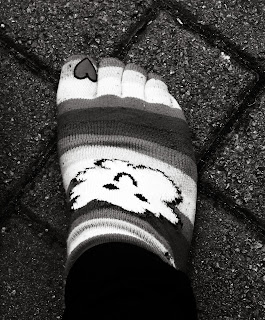
This is a picture of my my sock with my foot in it. I have changed the picture to greyscale to remove the colour and did not duotone it. I think this is a god example of tone because my sock is usually multicoloured but here many of the tones can be seen as quite similar as the colour has been removed.


This was not a picture that was chosen for my straight prints, I think the photo is not very interesting, it's very much generic and does not look professional, nor does it represent tone very well. I wanted to take pictures of the engine and some old cars to create an antique look, this was not achieved.


If I were to continue with this session I would look for more pictures that would usually look vibrant and colourful as well as pursuing my 'antique-looking' photograph with a duotone.
Mindmap


Research Log

Mike Walsen

Mike Walsen takes a range of different photographs from different topics and genres. However, he has an interesting collection of photos of lines, I could use such photographs for ideas and inspiration in my own shooting of lines. His section on lines is very electronic and colourful, I could try and use this in my own work on lines rather than the generic pictures of train tracks and guitars.


I like this photograph, it uses the reflection of lights in water that create lines. I think that this is very creative and far more interesting, complex and imaginative than normal photographs that concentrate on lines. This uses nightlife and interesting colours rather than a pattern or lines in nature.

http://www.mikewalsen.com/


Mr Bones

Mr Bones is an amateur  photographer who takes photos of many of the visual elements, including blurring and shape. I could certainly gain ideas and understanding from a few of his quite ordinary photos as they are easily achievable, they're not taken in any really extraordinary places and the concepts are quite simple. I generally like his simplistic work and could use some of his ideas in my own work.


This photograph shows a teddy bear on what seems to be a roundabout and is a great example of how blurring as well as still objects can be used to create the impression of a moving object. Photos like this, I think, are good photographs, though this photographer is an amateur and may not be suited for research as his photos are very much random.

http://www.flickr.com/photos/62392960@N00/140860685/


Paul Williams

Paul Williams has a series of photos that are used for postcards and arts cards that feature very colourful houses among dull backgrounds. He uses colour and a dull background in photography very well. Using this method could be useful; removing the colour from most or some of the picture to emphasise the object or focus of the picture that is in colour.


This is just one example of his many photographs that look at houses in streets. He uses the same editing each time, with brightly coloured houses and a dull, greyscale background. This very much emphasises the use of colour in his photography and his method could be used in my projects if I use colour at a further level.

http://www.paulwilliamsgallery.com/fine-art-photography-Places/fine-art-photographs-Burano.html


Mark Mawson

Mark Mawson uses a lot of colour in his Aqueous Fluoreau and Aqueous Electreau portfolios. He uses bright chemical reactions and sound to create explosions of colour. His photography is very interesting and I would love to be able to do something like it in one of my projects though it seems difficult to achieve without the correct equipment.


This photograph shows a giant explosion of underwater colour. These artistic methods of photography would certainly be something to look into if I use colour in the future. The picture looks quite extraordinary and even like something made by a computer animation entirely. 

http://www.markmawson.com/#/


Alexey Bednij

Alexey Bednij uses both shape and pattern in her photography. Pictures are taken of a number of different animals and their shadows in crazy patterns that take up the entire photograph. I could try to use these more interesting setups to create my own shoots for pattern in the studio.


This  photograph is very artistic and very imaginative, the use of so many cats and shadows use both shape and pattern to create such a photograph. Photographs like this one could be very helpful in my shape section especially.

http://www.feeldesain.com/shadow-photography-alexey-bednij.html


Trent Sizemore

Trent Sizemore takes pictures of many of the elements of art, one of which is tone. He takes mostly black and white photographs to show tone. I like these photos of nature and would like ti find some interesting places to shoot such flowers or interesting, colourful animals to shoot tone.


This photograph shows a close up of a plant in a black and white setting. This represents the tone of the different colours of the flower rather than its actual colour. This photo, like many more of his, are of natural things such as plants and animals. 

http://www.trentsizemore.com/


Jasper James

Jasper James has a collection called 'City Silhouettes' where he uses silhouettes of people over photographs of a city. I think that his ideas are good and the concept of these photos is very unusual but I don't think they would be very helpful to me in my photography.


This is one example of the 'City Silhouettes' portfolio. These photos are good examples of shape and are very different to ordinary silhouette photos. The city is somewhat more visible through the man than anywhere else, this creates the silhouette look. I like these photos, though it'd be hard to get any different ideas from them.

http://www.jasperjames.co.uk/project/people-and-places-2/


Daniel Kukla

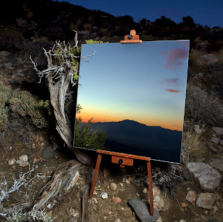
Daniel Kukla takes photos of mirrored reflections of a desert valley in America, his photos are very artistic and very imaginative. The photos look like something completely new and completely different have given me an insight to what can be done with reflection in photography.


I think that these photos are fantastic. The use of reflection here is very interesting and very out of the ordinary. I think that looking into this more would be very useful to me and has made reflection look a whole lot more interesting than just self shots in windows and mirrors. The mirrored image looks nearly like a painting, this is one of my favourite pieces of work. This photograph is a great example of how reflection can be used in artistic photography.

http://danielkukla.com/


Richard Vantielcke

Richard Vantielcke takes a series of interesting shape related photographs using shadow. His photographs are very generic and though of high quality and professionalism, will not give me any new ideas for shadow photography in my section on shape.

Though this picture is somewhat artistic, it  is quite boring and very much a generic shadow picture, just of higher quality in the setup than of some. I like this photograph but I don't think it or the others in the collection would be very useful in getting ideas for my own projects.

http://www.ludimaginary.net/light-shadow-photography-6.html


Jane Brown

I quite like Jane Brown's work, it is usually black and white and often show tone rather than colour. Her work often looks quite antique, usually still shots without colour. I think that her work would be quite useful in tone if anything.


I like this photograph, it is very generic but does show a lot of tone. It looks like the type of old photo that would be produced on a canvas and placed in a living room. Her work is often calm and still, like this photo. 

http://www.janebrownphotography.com/
Definition Page - Tone

Dictionary definition - The overall lightness or darkness of an area of an image.


  • Shade
  • Darkness
  • Lightness
  • Greyscale
This photo shows a setting that would, presumably, contain many colours. It has been set to black and white and so only the shades/tones of the different colours are visible. It shows the tone in many things and how the tone of colours can be the same while the colours are completely different.
This photograph also shows what should contain many contrasting colours as looking the same as they share the same tone. It shows how tone is used in real life, photographers, unlike the eye, are able to pick out the tone and remove the colours. People do not usually look at things, especially things of contrasting colours, by their tone.
This photograph is not only black and white, it shows the use of duotone, an alternative to black and white photography which adds one colour to the picture, replacing the ordinary black or white. This duotone shows the tone of this photo well, but can also be used to make photographs look perhaps, a little antique.
This picture is another good example of tone. The tone of some parts of the bridge, the people, the sea and the sky are very similar, though the colours are surely very contrasting when not removed.


My definition - The lightness, darkness or shade of a colour.
Definition Page - Depth

Dictionary definition - 
  1. The distance from the top or surface of something to its bottom.
  2. Distance from the nearest to the farthest point of something or from the front to the back.

  • Far
  • Bottom
  • Converging parallels
  • Distance
  • Stretched
  • Narrowing
This photo shows how depth is used in photography to represent the third dimension. This often done by shooting from one end of a long object or pathway to the other. The object or path begins to narrow and shows this depth in the photo, it is made clear that on end is further away from the photographer than the other. 
This photo also shows the narrowing of a path. This is the easiest way to show depth in a photograph, this photo makes it very clear that depth i s what is being looked for.
This picture does use the narrowing of the object in focus. These converging parallels are the best and most appropriate way of showing depth in photography.
This picture also uses converging parallels and differentiation of focus in some areas of the picture. This gives the impression that this object is in face made of three dimensions and one end is further away than the other.


My definition - A third dimension, a way of showing that there is more to something than just it's shape.
Definition Page - Pattern

Dictionary Definition - A repeated decorative design.

  • Repeated
  • Decorative
  • Chronological
  • Chequered
  • Even
  • Matching
  • Stripy
  • Spotted

This picture shows how pattern is seen in nature, in animals. This is  very obvious example but does show how many animals are just covered in pattern, whether it's for camouflage or decoration.


This shows how pattern is used by human in construction, it shows how pattern is useful to humans as it strengthens buildings and structures of walls and such. This example of a wall shows how pattern is used in the most simplistic structures that we use and see everyday.
This is an example of how patterns are used by people to represent different things in different situations, such as on roads and signs. These bright colours and the repeated patterns are used and seen in everyday life.


     This shows how pattern is seen absolutely everywhere in nature. The feathers themselves are made up of a striped pattern, while the feathers make a pattern, too. It shows how important pattern is in the structure of everything.


My definition - A repeated shape/set of shapes or set of colours.

Tuesday, 8 October 2013

Image Bank - Texture


This picture shows new fallen snow and shows how texture is caught in photography using the sunlight as it hits an object and creates shadows that rectify its texture.


This picture shows another simple method of looking at texture in photography; an in-focus, close up picture can be taken of an object with a very defined structure/texture.


This is another good example of how the sun can be caught on an object to expose its craters and texture. It is very easy to use this method to capture the texture of rough surfaces.


This shows how texture is most easily seen in photography; the grain in wood is a very good example of where texture can be seen in pictures, the craters and crevices are very clear and very defined; they create deep, dark shadows that really highlight its texture.